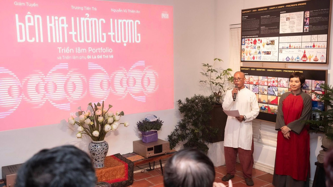
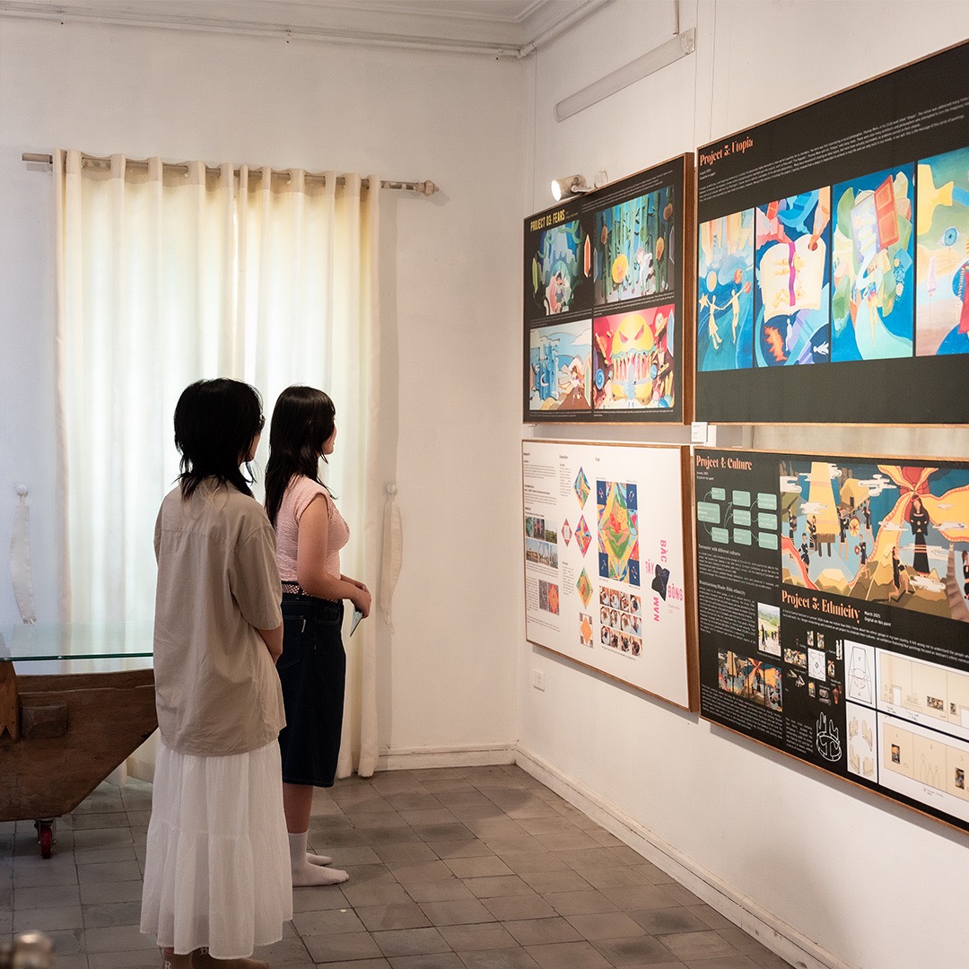
CONTEXT AND CHALLENGE
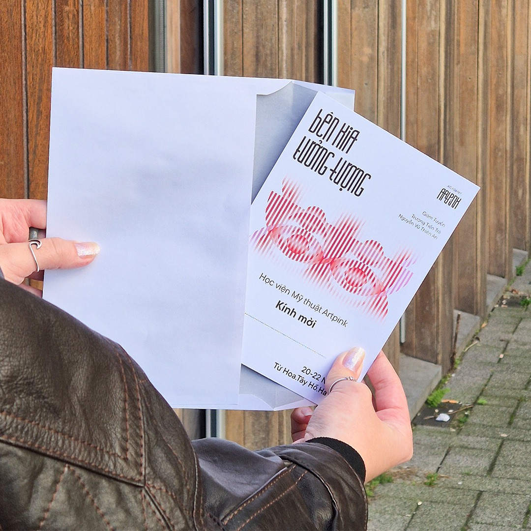
Artpink is Vietnam’s first preparatory academy for studying the arts abroad. After 6 years of operation, their students’ works have evolved from traditional art forms to experimental and contemporary expression. With a collaboration of a young curator and an experienced curator, Artpink’s annual exhibition required a fresh visual identity - one that captured the academy legacy of elite art education while bringing young, forward-looking energy. At the same time conveying core messages of To go is to return, a metaphor for the cycle of students study abroad and come back to contribute to the local art industry.
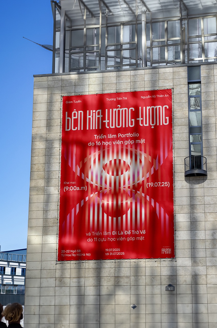
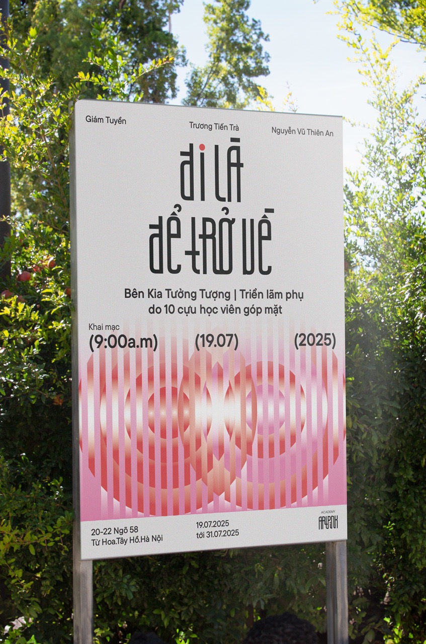
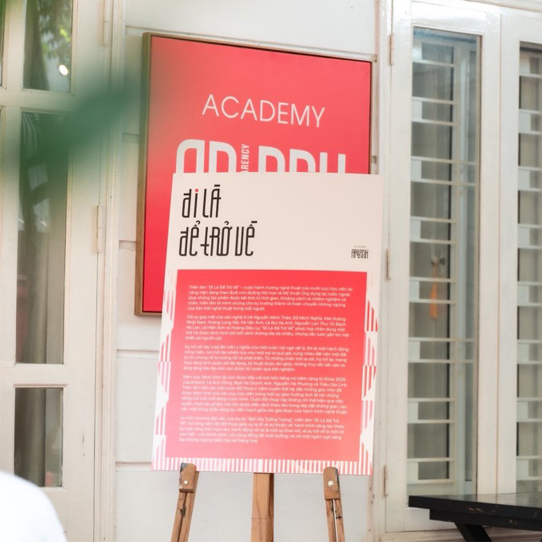
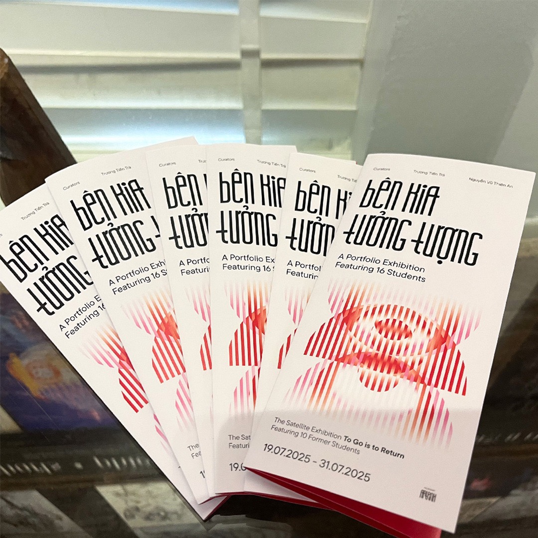
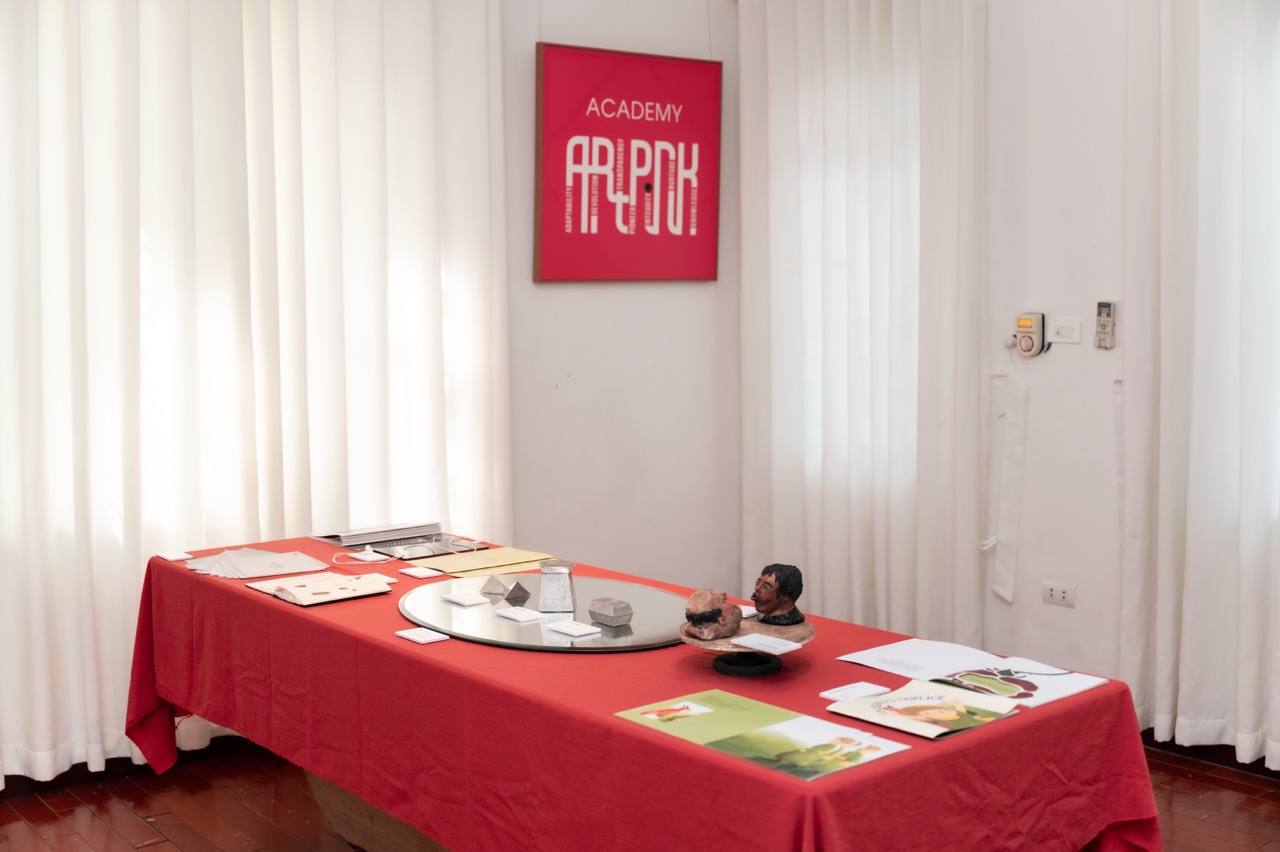
SOLUTION AND DESIGN
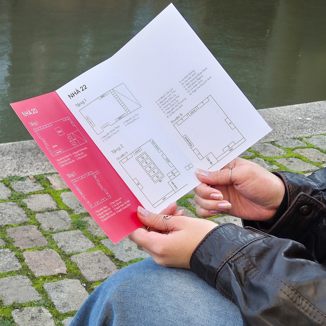
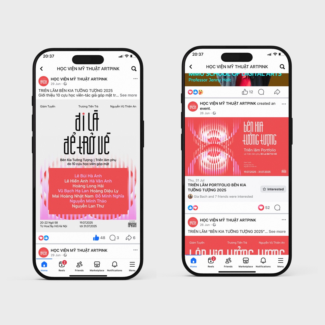
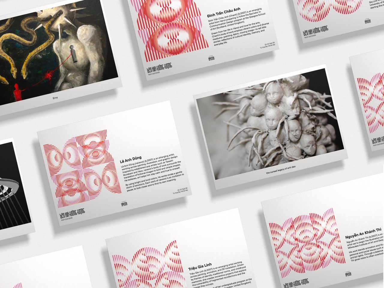
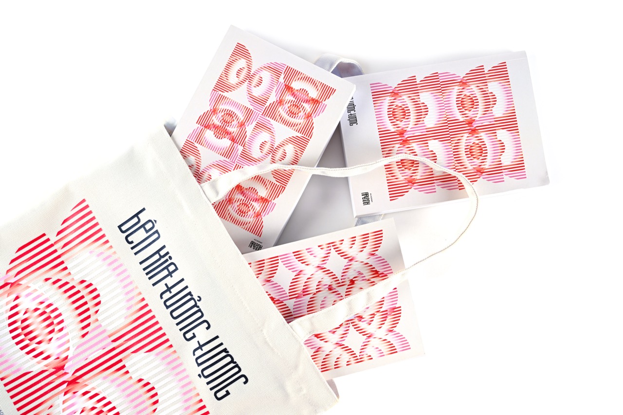
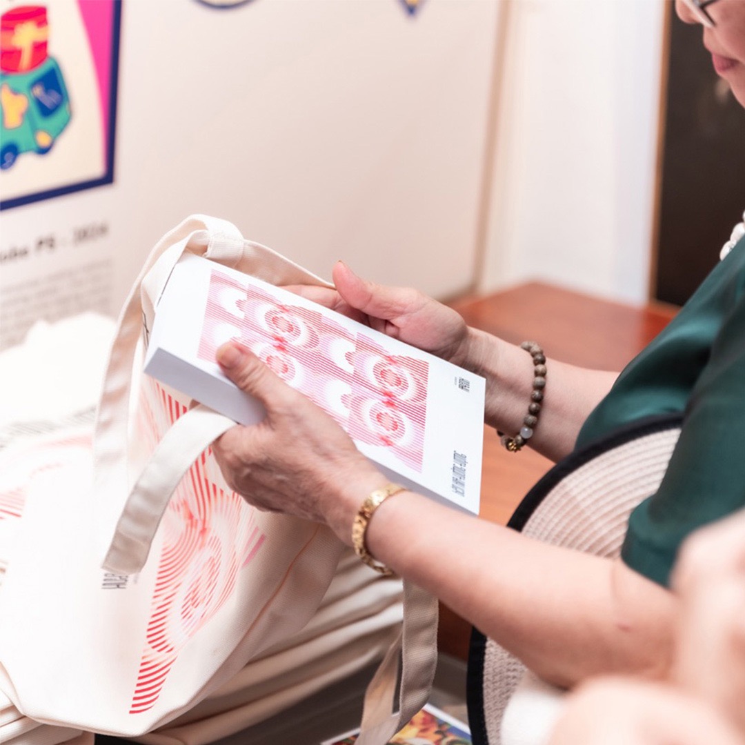
The geometric circles motif symbolizes both the circulation of clouds and water—mirroring the concept of “to go is to return,” where evaporation and rainfall represent the continuous cycle of learning abroad and returning home to contribute. At the same time, interwoven stripe forms evoke a dreamlike landscape where reality and imagination blur, inviting visitors into a creative world. The exhibition introduces a flexible, easy-to-apply pattern system. However, it still maintains a strong connection to the original identity through the continued use of Artpink’s iconic typeface and its signature red-and-white color palette.